
behind the rebrand
Rebranding is defined as a marketing strategy that involves changing a company's image, logo, look, related visual assets, and marketing materials. The goal of rebranding is to create a new and differentiated brand identity in the minds of consumers, retailers, prospects, competitors, employees, and the general public. In July, we were excited to announce new branding, bottles, and website updates. Thanks to all of the likes and love we have received since then, we’re certain we made good by our consumers.
While we have a new look, we still offer the same quality and cultured ginger beer blends you know and love. So, in this blog we’re going to showcase what’s new and the inspiration behind our rebrand. 👉 Let’s bop.
Fresh Logo
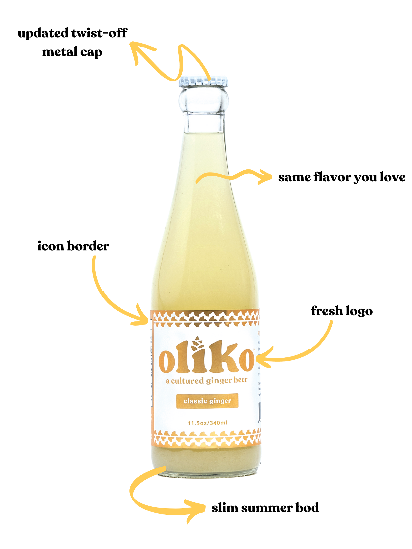
With the anticipated launch of our Blackberry Mint blend, we wanted to create a logo as fresh as our flavors. We partnered with a designer, Ian Gilliland with Federal Design Co, to help us develop a new logo that would represent what it feels like to sip OliKo: fresh, fun, memorable, and elevated. The new logos are set in the updated color palette to resembles the natural color of each flavor. And to help us showcase the varying flavor profiles, we created ingredient icons that you’ll see as borders on the bottle label. These icons are also recognizable on our website, in marketing assets, and across our social content. Designed to be easily identifiable, so you can find your favorite flavor just by looking for the icon and color on the label.
In addition to updating our logo, we also refreshed the style of our tagline, “stay spicy.” The design detail above the “i” is an artistic rendition of a ginger flower.


Bottle Shape
Our friends at Mor Kombucha made us laugh when they said the new bottle shape represented our “slim summer bod.” While the bottles are slimmer than the original, the inspiration behind the new bottle shape is simple: we want the bottles to represent the cool, refreshing, delicious flavors within.
In addition to our slim summer bod, we also updated the cap. The new twist-off, metal cap you’ll see on the bottles was inspired by our partnership with 1% for the planet and our commitment to sustainable packaging. We wanted to do away with as much plastic as possible and reduce our carbon footprint.
Website
We couldn’t rebrand our brand and bottles without refreshing our website. The new website was developed for a better user experience from the moment you visit the homepage. We partnered with Boulder local web designer Ryann Russ to help us bring our vision to virtual reality. Her expertise helped us make the site more intuitive, easier to navigate, and in alignment with our new branding.
For example, we transitioned all of our recipes to our blog and categorized them by the flavor of OliKo featured in each recipe. To make it easier for you to find cocktail and mocktail recipes made with your favorite flavor, we linked the recipes to each flavor profile page. Less searching, more sipping!